STUDENT ZEN
Case Study

Project Overview
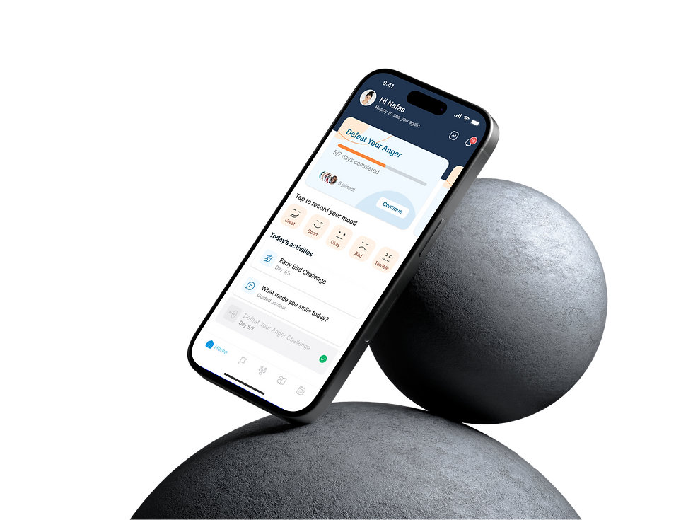
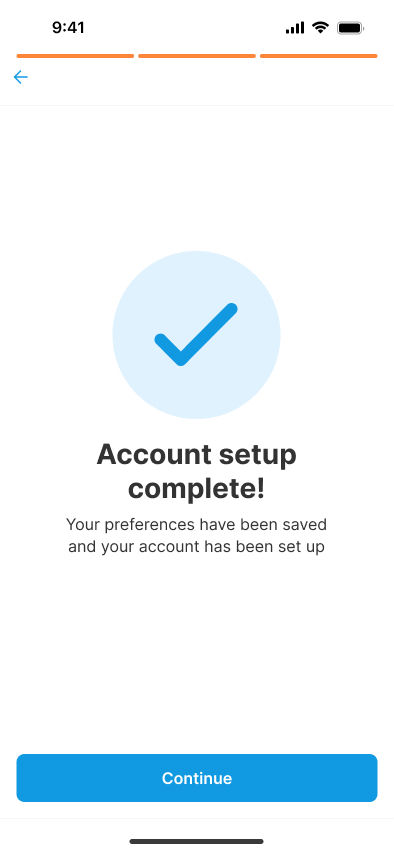
Student Zen is a mobile digital platform for Students between 16 and 25 that aims to improve the students' mental health. The design thinking was utilised framework to develop a mental health application, focusing on user-centred design principles.
Problem
Students frequently face significant challenges such as academic pressures, financial stress, and social isolation. These issues can adversely affect their mental health, academic performance, and personal relationships, making it difficult for them to maintain a balanced and resilient lifestyle.
The Process
The project aimed to improve the mental health of students. Tools like Figma, Photoshop, and Illustrator were utilized to design a user-friendly app. The project ran for 4 weeks from January to April 2023. Also, user testing was conducted to ensure this application worked well. My responsibilities were UX researching and UX designing. Addressing mental health in students is essential because it enhances academic performance, improves quality of life, and sets a foundation for long-term well-being. It also helps reduce dropout rates, fosters a supportive community, and has economic benefits by decreasing healthcare costs and creating a more resilient workforce.
My Role
I served as both the UI/UX Designer and Graphic Designer for this project, contributing to the user experience design and creating graphic elements to support the visual identity and branding.
Research
StudentZen began with ideation, market research, and competitive analysis.
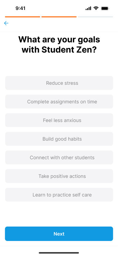
Student Zen focuses on students aged 16-25, a critical time when they face changes like adjusting to college, meeting academic demands, forming relationships, and planning careers. The research used surveys and interviews to understand their mental health challenges, such as stress, anxiety, and anger. Students often resorted to ineffective methods like oversleeping or ignoring their feelings. However, they expressed a need for new, engaging approaches and professional help. They also valued community support, and finding comfort in shared experiences. The findings highlight the need for innovative activities and stronger community connections to support students throughout their academic lives.
Quantitative Research
A mental health questionnaire completed by 34 students found 60% self-criticize mistakes, education and relationships are key challenges, most feel safe sharing emotions without fear of judgment, and depression and anxiety are the most commonly reported issues affecting students’ mental well-being.
Qualitative Research
Interviews were conducted with participants about their experiences while they faced mental problems. All participants were students and a few of them had experience with using mental health applications. Here are some questions and their corresponding answers that have been asked and received.
Persona

The Student Zen app is designed to help students manage stress and improve their well-being by promoting key self-care practices. These include exercise, meditation, socialising, eating healthily, and getting sufficient sleep. By incorporating these habits, the app aims to boost students' academic performance and enhance their personal relationships, making them happier and more capable of handling the challenges of student life.
-
Challenges based on psychological principles.
-
Direct questions to therapists.
-
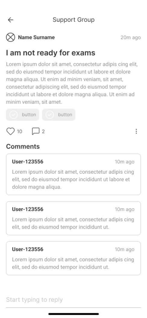
A community space for user interaction.
-
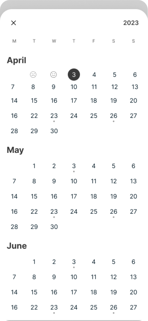
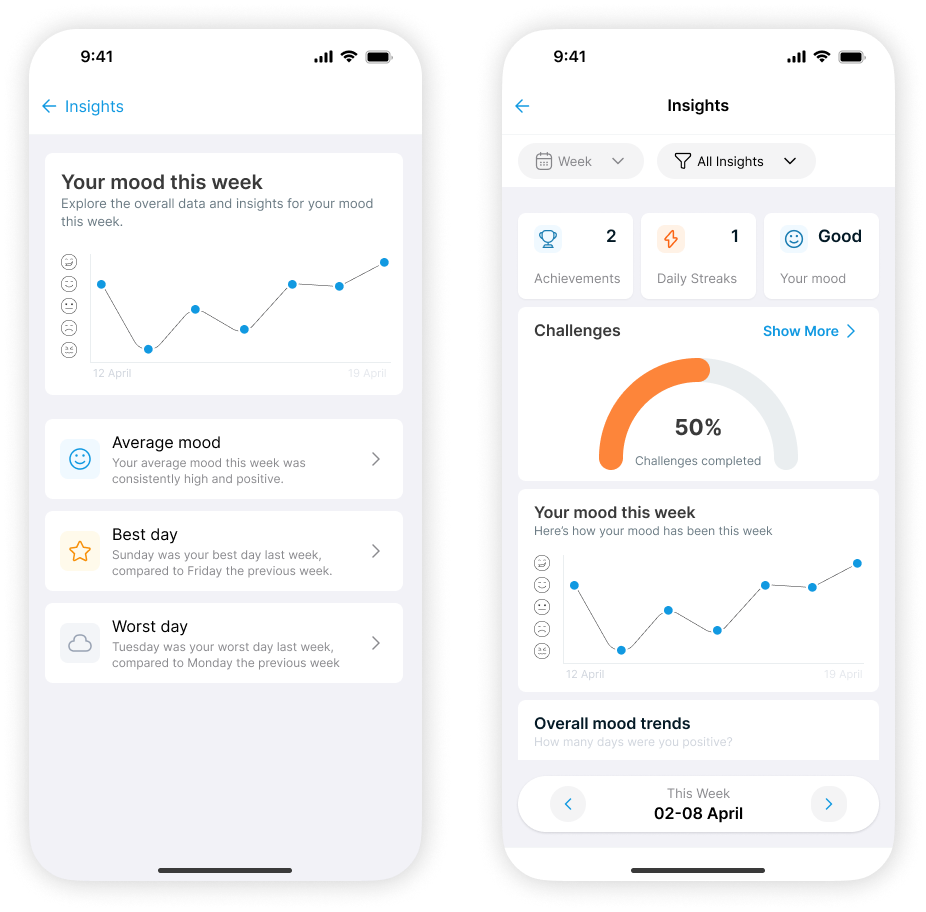
Mood tracking with detailed insights over time.
-
Guided journaling to deepen reflection on personal issues.
-
Notifications for timely activity suggestions related to upcoming events.
-
Customisable lists of favourite activities.
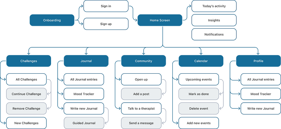
Flows
Wireframes

.png)
Logo
Illustration
Typography
Colors
Sky Blue
#1199E1
Tangerine
#FD853A
Jade Green
#12B76A
Fiery Red
#F04438
Slate Gray
#98A2B3
Components
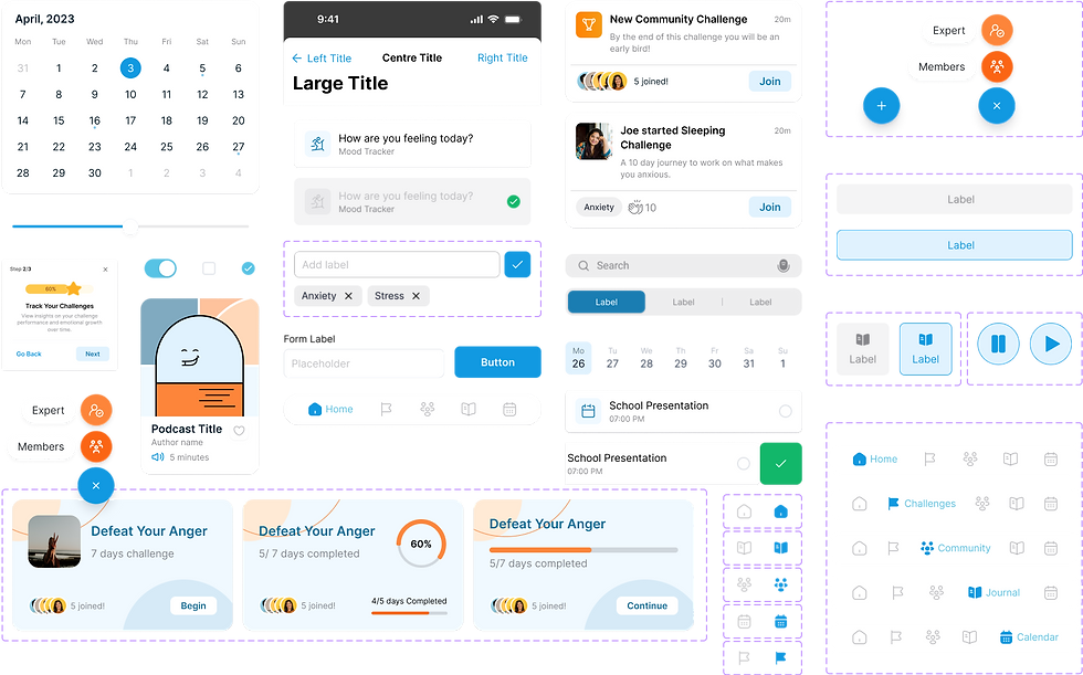


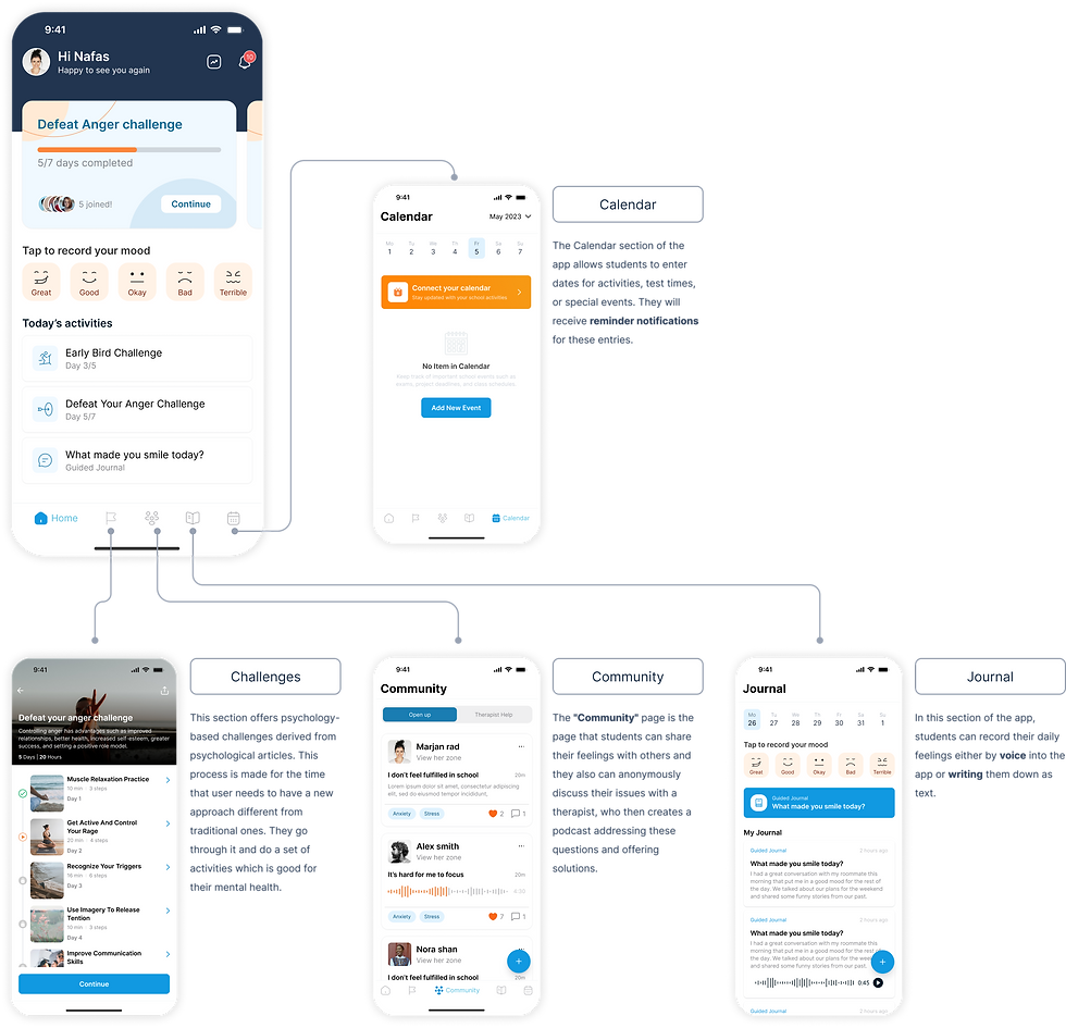

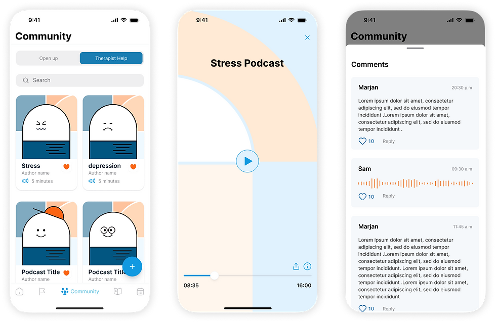
In the "Therapist Help" section, students can anonymously share their issues with a therapist. The therapist responds by creating a podcast that addresses their questions and provides solutions. Students can also learn more about the therapist, read their bio, send messages directly to the therapist, and receive responses.
In the "Therapist Help" section, students can anonymously share their issues with a therapist. The therapist responds by creating a podcast that addresses their questions and provides solutions. Students can also learn more about the therapist, read their bio, send messages directly to the therapist, and receive responses.
| " The colour of the card on the homepage is really cool."
| " I like being able to talk to a therapist and get answers through a podcast."
| " I really like the achievements section; I want to earn more of them."
| " Oh, I can talk to other members who have the same issues."
| " I like the animations in the navigation parts."
| " The characters are so cute."
Positive
Feedback
| “ Community icons looks like profile page. went to journal first because icon looks like a book so.”
| “ Finding Send a question to an expert.”
| “ Hard to find the therapist screen and confused about where the add button.”
| “ It is hard to find the calendar icon and hard to add data in to it.”
| “ Adding a label to the community part is a bit confusing.”
| “ Send feedback to therapist.”
Negative
Feedback
What I learnt:
-
Through conducting interviews, I discovered that user needs are extensive and diverse.
-
Performing competitive analysis from the users' perspective is more beneficial than from our own.
-
In the usability phase, gathering extensive feedback allows us to bravely implement necessary design changes.
What is my vision for the future:
-
Accessible Well-being: Create a convenient platform that promotes healthy habits to enhance students' overall well-being.
-
Mental Health Resources: Offer tools for mental health support, self-reflection, and goal-setting through engaging challenges.
-
Inclusive Community: Build a safe and supportive community where students feel empowered to manage their mental health and excel both academically and personally.
After finalising the high-fidelity prototype, a face-to-face usability test was conducted involving student participants. Recognising and addressing mistakes is crucial in this process. Usability testing focuses on trial and error and improving the design. During these tests, several errors were identified and were implemented the necessary corrections.
A mixed-methods methodology was used to test 10 participants for collecting both quantitative and qualitative data. The unmoderated testing approach and think-aloud protocol were taken.
The test goals included the following:
Measure and record the time it takes for students to complete activities and overall task flows.
Assess users' ability to successfully complete activities and challenges, including identifying any critical errors or points where they get stuck.
Evaluate the user-friendliness of the design, including navigation and placement of relevant information.
Analyse the steps users take to complete challenges, noting successful task flows and helpful UI features for further insights.
Applying changes after feedback
By the help of the usability test, potential problems were uncovered by users and the following changes were implemented on them.
Home
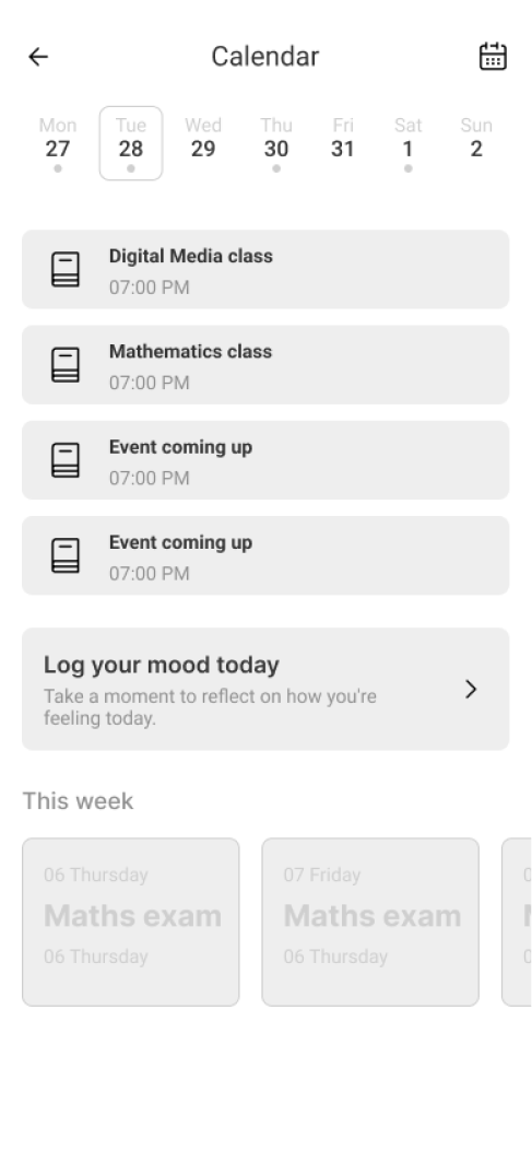
Participants found the "Tap to record your feeling" card confusing and assumed it had multiple steps, causing hesitation to use it. Additionally, users needed to swipe between characters to select their mood, resulting in extra clicks.

Journal
Similar to the Home page, users found the "Tap to record your feeling" card confusing and assumed it had multiple steps, causing hesitation to use it. Additionally, users need to swipe between characters to select their mood, resulting in extra clicks.
To make the functionality consistent across the application, the banner was updated and redesigned with distinct emojis used in the home page, making it easier for users to understand its purpose and resulting in the elimination of an extra step.

Challenges
Similar to the Home page, users found the "Tap to record your feeling" card confusing and assumed it had multiple steps, causing hesitation to use it. Additionally, users need to swipe between characters to select their mood, resulting in extra clicks.
To make the functionality consistent across the application, the banner was updated and redesigned with distinct emojis used in the home page, making it easier for users to understand its purpose and resulting in the elimination of an extra step.
