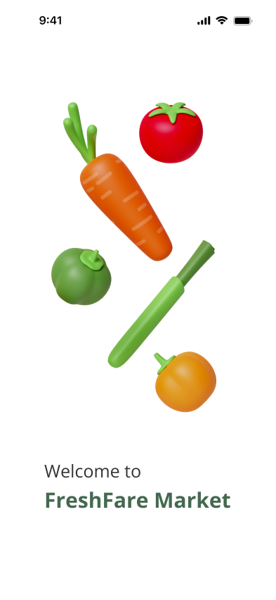
FRESHFARE MARKET
Case Study


Project Overview
The merging of UX design with Disability studies enhances digital inclusiveness, targeting the eradication of barriers for those with disabilities. It uses knowledge from different fields to make technology easy to use for everyone and helps people with disabilities to be more independent.
Despite their active use of technology, many disabled individuals face significant challenges. The FreshFare Market application addresses these needs by providing accessible features for users with visual, physical, cognitive, and hearing impairments.
The Process
This project was dedicated to meeting the unique requirements of disabled users for ordering vegetables and fruit. I employed resources such as WCAG, Photoshop, Figma, and user testing to guarantee both accessibility and usability. The project lasted 12 weeks, stretching from May to September 2023.
Problem
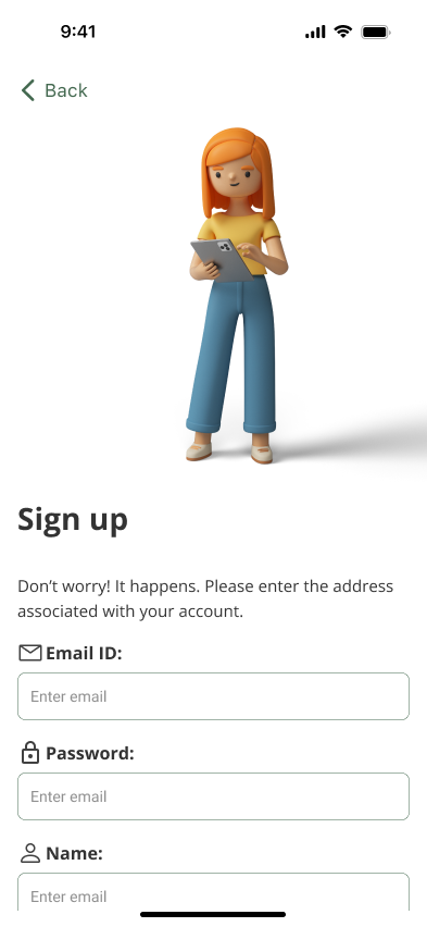
FreshFare Market exemplifies this by catering to users with various impairments, offering an accessible platform for fruit and grocery shopping. It prioritizes user experience and equal access through features like screen readers, speech-to-text, and customizable visuals, aimed at improving engagement and supporting diverse needs. This initiative underlines the critical role of accessibility in UX design, advocating for an inclusive digital environment that accommodates all users.
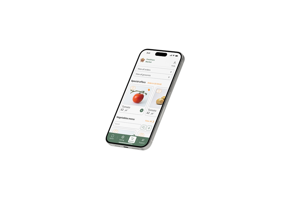
Solution
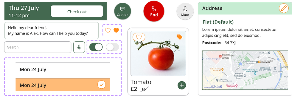
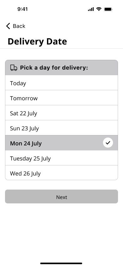
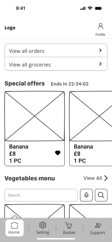
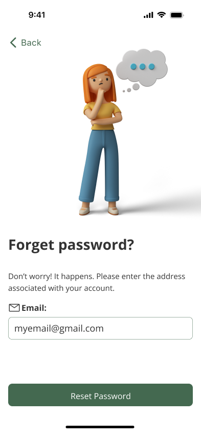
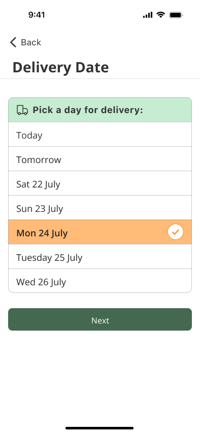
The key features of screen readers, are customizable text and background colours, voice input, and high contrast settings to ensure compliance with WCAG guidelines. The app supports both web and tablet platforms and it provides a seamless user experience that enhances independence and quality of life for its users.
My Role
I served as both the UI/UX Designer and Graphic Designer for this project, contributing to the user experience design, WCAG guidelines and creating graphic elements to support the visual identity and branding.
Background
Vegetable and fruit ordering apps make buying fresh produce easy but can be difficult for disabled users. Problems include poor compatibility with screen readers for the visually impaired, hard-to-use navigation for those with cognitive issues, and inaccessible delivery points for people with mobility challenges. To help, these apps need to be more user-friendly, offer better customer support, and ensure delivery services are accessible to everyone.
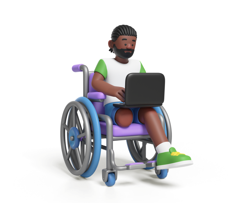
Mobility impairment
01
Hearing impairment
02
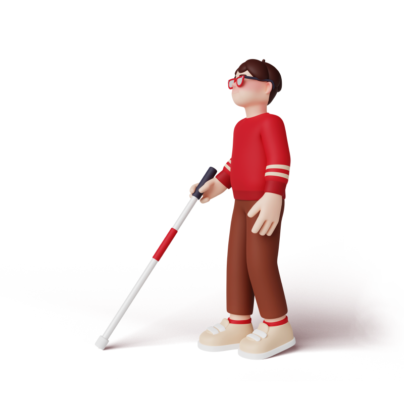
Visual impairment
03
Cognitive impairment
04


Research
The study combined qualitative and quantitative methods to investigate the challenges adults with disabilities face when buying vegetables and fruits. It involved surveys, interviews, and usability testing to understand their needs, preferences, and problems. The research aimed to:
1. Gaining insight into the particular needs and preferences of adults with disabilities.
2. Determining the obstacles that adults with disabilities face when ordering vegetables and fruits.
3. Investigating ways to improve accessibility and inclusiveness in the vegetable and fruit purchasing process.
Data was gathered through an online survey that addressed topics such as reserving items and accessibility features, collecting responses from 40 participants. Additionally, interviews with five adults provided deeper insights into their personal experiences and suggestions for improving the online ordering process.
Persona

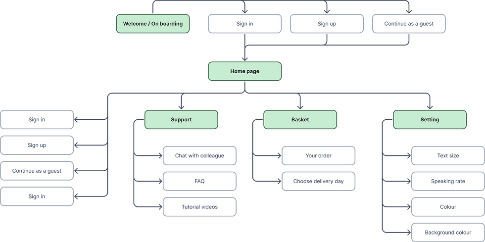
Information Architecture
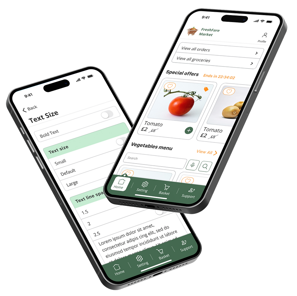
I crafted the visual interface with a keen focus on adhering to WCAG guidelines, ensuring that the design is highly usable for people with a variety of disabilities, including visual, auditory, cognitive, and motor impairments.
I selected a colour palette featuring a contrast ratio of 6:1, which ensures that text is distinctly legible against its background, facilitating easier reading for users with visual impairments.
For universal text clarity, I chose the Open Sans typeface, renowned for its readability on various devices and platforms. Additionally, I utilized solid icon styles to provide better contrast and more pronounced visual cues, which are particularly beneficial for users with visual challenges.
The application boasts a streamlined and user-friendly interface, incorporating accessible elements such as buttons, and input field components. I also integrated support for assistive technologies, including voice input options, to make the app more accessible to individuals with disabilities. These inclusive design practices underscore the thoughtful considerations implemented to create an accessible and efficient user experience.
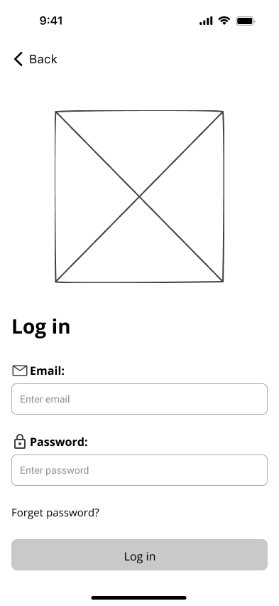
Low-Fidelity


Inclusive Design for Visual Impairment
-
WCAG 1.4.11 - Non-text contrast (Level AA) requires a minimum contrast ratio of 3:1 for essential visual elements like icons and buttons against their backgrounds.
-
WCAG 1.4.3 - Contrast (minimum) (Level AA) mandates a minimum text contrast ratio of 4.5:1 between text (and text-like images) and their backgrounds to enhance readability for users with visual impairments.
-
WCAG 1.4.4 - Resize text (Level AA) requires that text can be resized up to 200% without loss of content or functionality, ensuring accessibility for users with visual impairments.
Inclusive Design for Mobility Impairment
-
WCAG 2.5.5 - Target Size (Level AAA) makes it easier for people with physical disabilities to interact with the mobile application's buttons. The target size is a minimum size of 44 by 44 pixels.
-
WCAG 1.4.13 - Content on Hover or Focus (Level AA) ensures that content like tooltips, which appear on hover or focus, must be dismissible, hover-able, and remain visible until intentionally dismissed to aid accessibility.
-
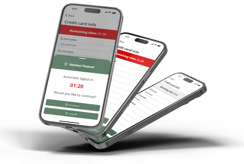
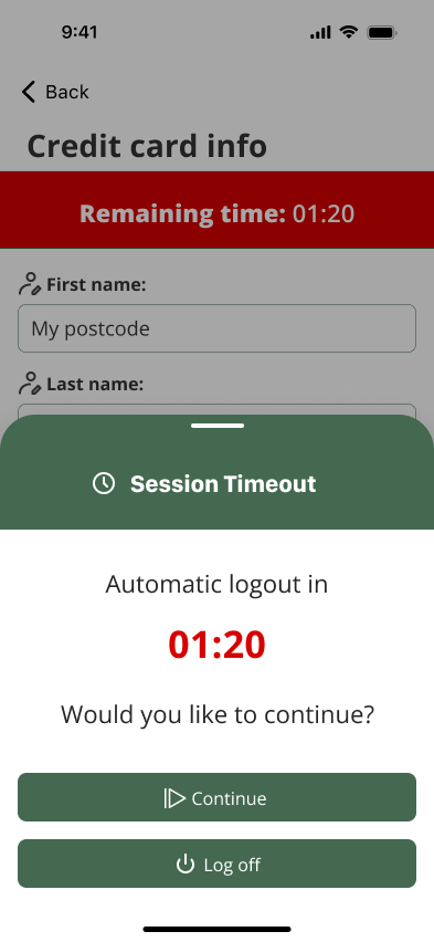
WCAG 2.2.3 - No timing (Level AAA) addressing timing constraints, ensures that people with physical disabilities have ample time to complete transactions by initially providing 10 minutes and offering an extension as the deadline approaches.
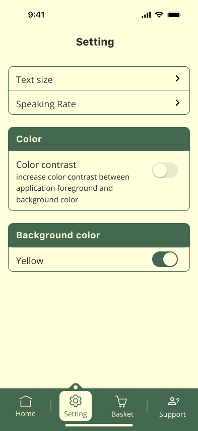
Inclusive Design for Cognitive Impairment
-
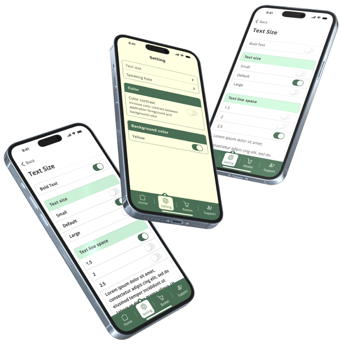
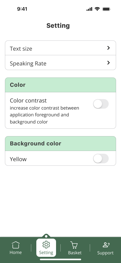
WCAG 1.4.12 - Text Spacing (Level AA) mandates that text line height, paragraph, letter, and word spacing must be adjustable to enhance readability for users.
-
In the settings, users have the option to change the background color to yellow, which can significantly improve visibility and reading ease for individuals with dyslexia.
Inclusive Design for Hearing Impairment
-
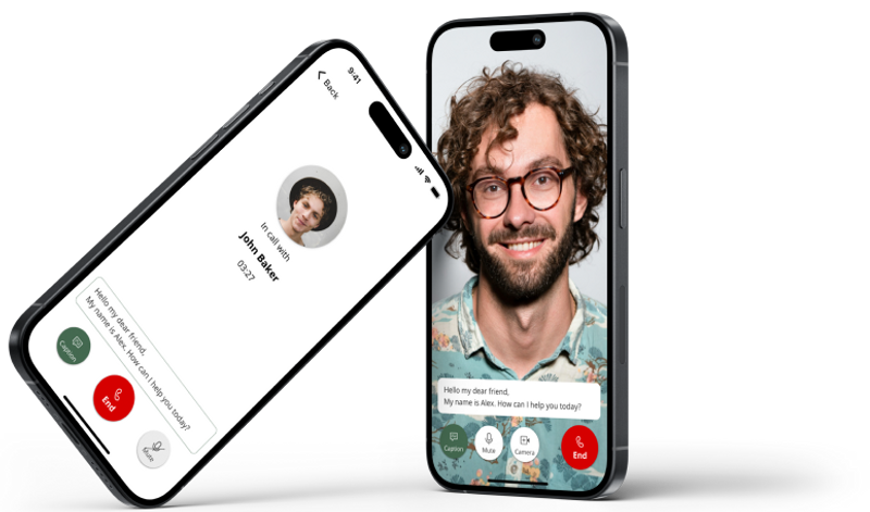
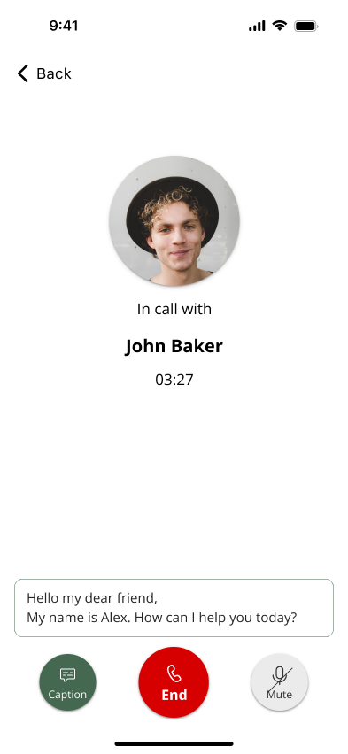
WCAG 1.2.4 - Captions (Live) (Level AA) mandates that live audio content in synchronized media, such as live-streamed videos, must have captions to make it accessible to users who are deaf or have hearing impairments.


Usability Test
The study included 15 participants and was conducted remotely using video conferencing tools, enabling them to engage with the prototype in a controlled setting. The sessions were moderated, guiding participants through particular tasks. Throughout the sessions, participants were encouraged to verbalize their thoughts, offering valuable insights into their thought processes and interactions with the app.
Next Step
In the future, I plan to focus on enhancing and expanding the FreshFare application to better serve users with disabilities. This involves incorporating more advanced accessibility features, conducting extensive user research, and integrating the latest assistive technologies. My goal is to ensure the app remains at the forefront of accessible UX design, providing an inclusive and seamless grocery shopping experience for all users.
Key Areas to Focus On:
-
Implementing cutting-edge accessibility tools like AI-driven voice assistants and real-time text-to-speech.
-
Integrating the latest assistive technologies to enhance user experience.
-
Regularly updating the app based on user feedback and technological advancements.
-
Engaging with the disability community to better understand their needs and incorporate their insights into the app's development.