DIGITAL lNFLUX
Case Study


Project Overview
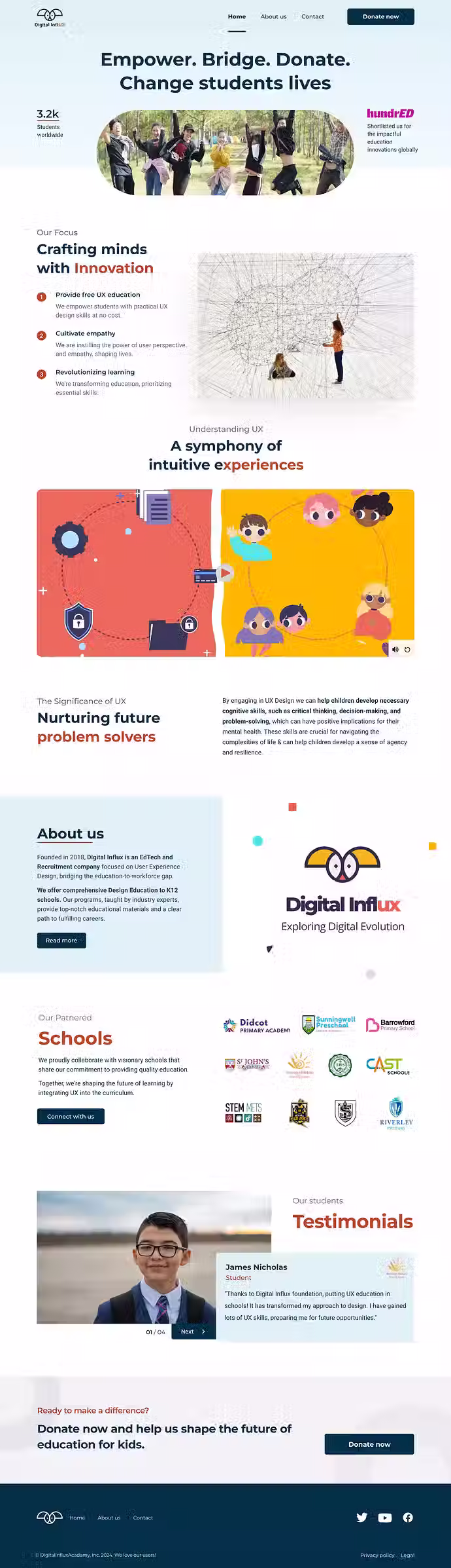
Digital Influx, an ed-tech company specializing in UX design education, launched a dedicated foundation website to expand its mission of providing quality educational resources to underprivileged children. This new platform focuses on raising funds to support free UX design courses for K-12 students.
Process
The project aimed to address user navigation and engagement issues in the donation section of the Digital Influx website, improving ease of access to company information and donation options. Tools like Figma, Miro, and Illustrator were used to create wireframes, prototypes, and a streamlined user interface. The project spanned four months, from December 2023 to March 2024.
Problem
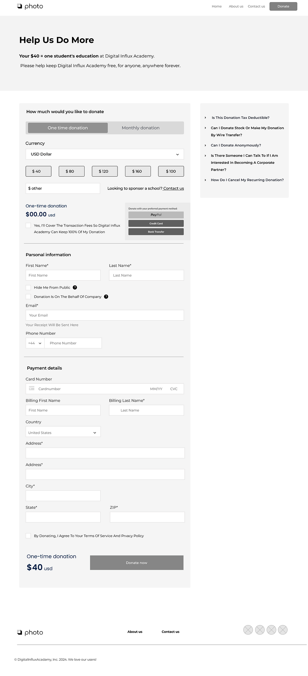
The Digital Influx website's poor navigation and overwhelming layout in the donation and sponsorship sections led to low engagement and limited support. With the sponsorship page hidden under a dropdown and confusing options, users struggled to take action. Additionally, the lack of emotional resonance in content and an inflexible donation form discouraged smaller contributions, resulting in high bounce rates and reduced donations.
My Role
Working in a startup often requires versatility and adapting to various roles. Although my primary responsibility was as a graphic designer for the Foundation website, I frequently shifted focus to support other projects as needed, contributing across different areas to help drive the company’s initiatives forward.
Project's goals

01|
Build a separate website that clearly explains Digital Influx’s mission to help children in need.
02|
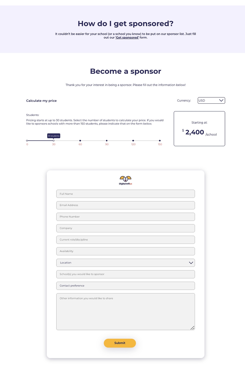
Design a simple, attractive website that makes it easy for people to find sponsorship options and donate any amount they choose.
03|
Add features to keep donors updated on the foundation’s progress and show them the difference their support makes.
04|
Show donors exactly how their donations are being used, so they can see the impact they’re making.
Project's goals
01|
Build a separate website that clearly explains Digital Influx’s mission to help children in need.
Design a simple, attractive website that makes it easy for people to find sponsorship options and donate any amount they choose.
03|
Add features to keep donors updated on the foundation’s progress and show them the difference their support makes.
04|
Show donors exactly how their donations are being used, so they can see the impact they’re making.
02|
User Research
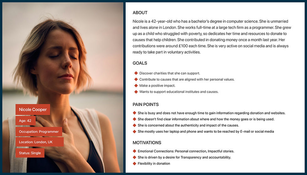
We began by meeting with stakeholders to set goals, then conducted surveys with 30 participants and interviewed 5 professionals to understand key motivators and pain points in donation behaviors, revealing important challenges. Market research included interviews with donors to learn their motivations, discussions with educators on children’s UX learning needs, and a review of competitor platforms to identify effective donation strategies.
User Insights

Participants wanted regular updates on the children’s progress, including their projects and achievements.
Success stories and information on the impact of donations were seen as motivating factors.
Donors expressed a desire for more clarity on fund usage and a breakdown of how donations are allocated.

Share clear fund usage and success stories to show donors the impact of their contributions.

Create an easy donation process with flexible options for one-time or recurring contributions to meet donor needs.
Use social media as a primary communication channel to strengthen donor connections and build trust.
Key insights
User Research
Competitive Analysis
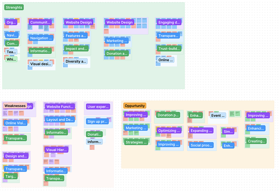
In the competitive analysis, a SWOT was conducted, and five donation platforms were reviewed to identify industry standards in design, functionality, and user engagement. These insights were used to shape our prioritized feature list and guide the design process.

Successful platforms put clear donation buttons on the landing page, making it easy for users to donate.
They highlight their mission and values so users quickly understand what the platform stands for.
Good use of whitespace and simple layouts make the site easy to use and navigate.
Platforms that offer both donation and volunteer options give users flexible ways to get involved.
Success stories, regular updates, and donation numbers make users feel secure and informed.
Ideation
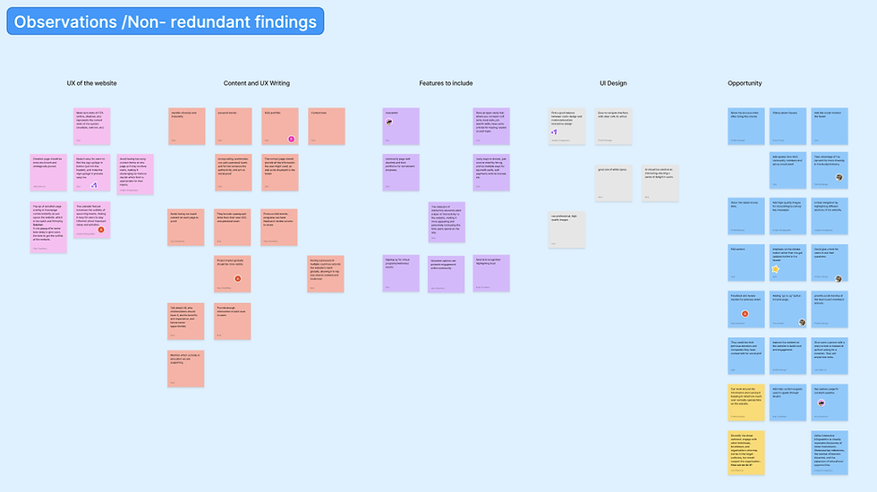
Our team met to discuss and perform a SWOT analysis to look at what the project does well, where it could improve, potential opportunities, and any risks. We also used card sorting to organise and rank different ideas, helping us identify the most important parts for the platform before starting the design phase.
Mid-Fidelity
Developed mid-to-high-fidelity wireframes for key pages, including the homepage, about us, contact us, and donation pages, to organize content effectively. We conducted usability testing with users and gathered feedback through stakeholder reviews. After making necessary adjustments, we progressed to high-fidelity wireframes and created stylescapes to explore various visual approaches.
Conducted A/B testing on two different donate page designs with stakeholders during weekly reviews and with users to determine which design best met both business and user needs.

Style Guide
Primary Colors
Secondary Colors
Neutral Colors
Typography
Hierarchy
Spacing
Radius
Text Input
Buttons
Active
Hover
Disabled
High-Fidelity
Home Page
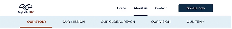
The Contact Us page is now more organized and offers an easier way to reach out. It includes a messaging form along with essential contact details for seamless communication. Additionally, social media links have been integrated to align with users’ preferred communication channels and enhance engagement.


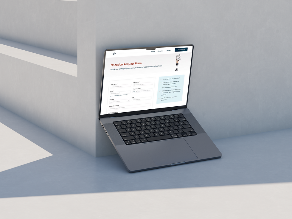
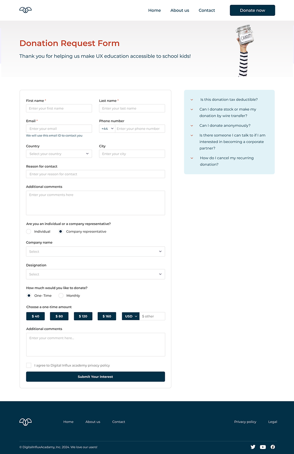
Donation Page
Contact Us Page

The Contact Us page is now more organized and offers an easier way to reach out. It includes a messaging form along with essential contact details for seamless communication. Additionally, social media links have been integrated to align with users’ preferred communication channels and enhance engagement.
